
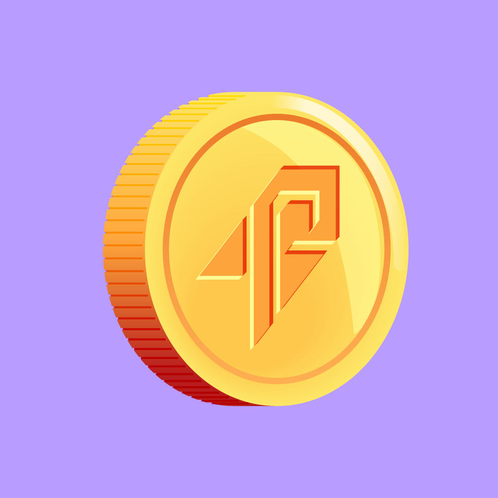
Rocket Dollar
2021–2022
Animation, Icon Illustrations, Vector Art, Pixel Art
Rocket Dollar is a fintech platform that helps users invest their retirement dollars in alternative assets — real estate, crypto, startups, and more. Over about nine months, I completed three distinct projects with their team, starting with a one-off animation and growing into a sustained illustration partnership that left a mark on their product.
Project 1 — "Back to the Future" Animation
Summer–Fall 2021
The first project was a commissioned animation: a looping GIF of a DeLorean time machine, styled to Rocket Dollar's brand. The metaphor was on-brand for a company whose whole pitch is about putting your future in your own hands.
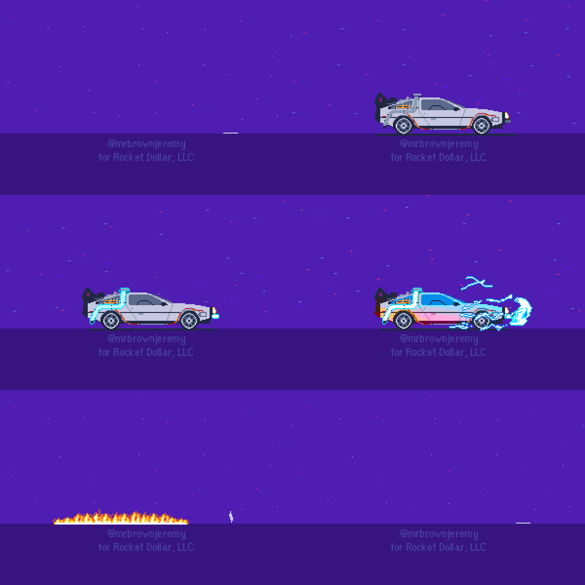
The finished product.
I delivered multiple passes, along the way adjusting flame taper, timing, sky and ground colors per their branding guide, air particle effects, license plate treatment, and the car warm-up sequence. Each version came in @1x, @2x, and @3x resolutions for HiDPI screens, plus two canvas sizes (320px and 600px). After two review cycles with Rodney Martinez (their product designer) and leadership, the animation was approved and invoiced in late September 2021.
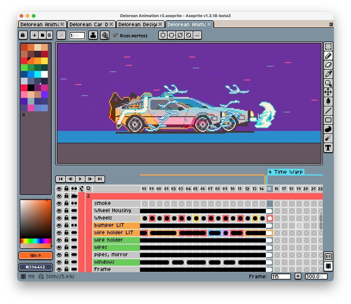
Drawing the car was a task unto itself. From there, I added many, many layers to create the various effects throughout the animation.
It was a clean and energizing first engagement. Quick feedback loops, responsive client, clear approval. By the time we wrapped up the animation, they were asking me about illustrations, and I was eager to hop in.
Project 2 — App Illustrations
October 2021
Rocket Dollar needed a set of nine illustrations for their app's navigation and dashboard. The brief called for simple, readable, and distinctive images to represent core product concepts:
Home — domed house with chimney
Invest — seedling growing from dirt
Fund — golden coin
Profile — astronaut (revised from an initial unisex figure)
Investment Account — glowing treasure chest
Bank Account — Greek Doric-style bank building
Rewards — "a gift that gabs"
Transfers — a hitchhiking treasure chest
Contribution — a treasure chest eating a contribution
Scope agreed upon October 5. First draft delivered on October 11. Final files shipped on October 18–19.
Thirteen days, start to finish.
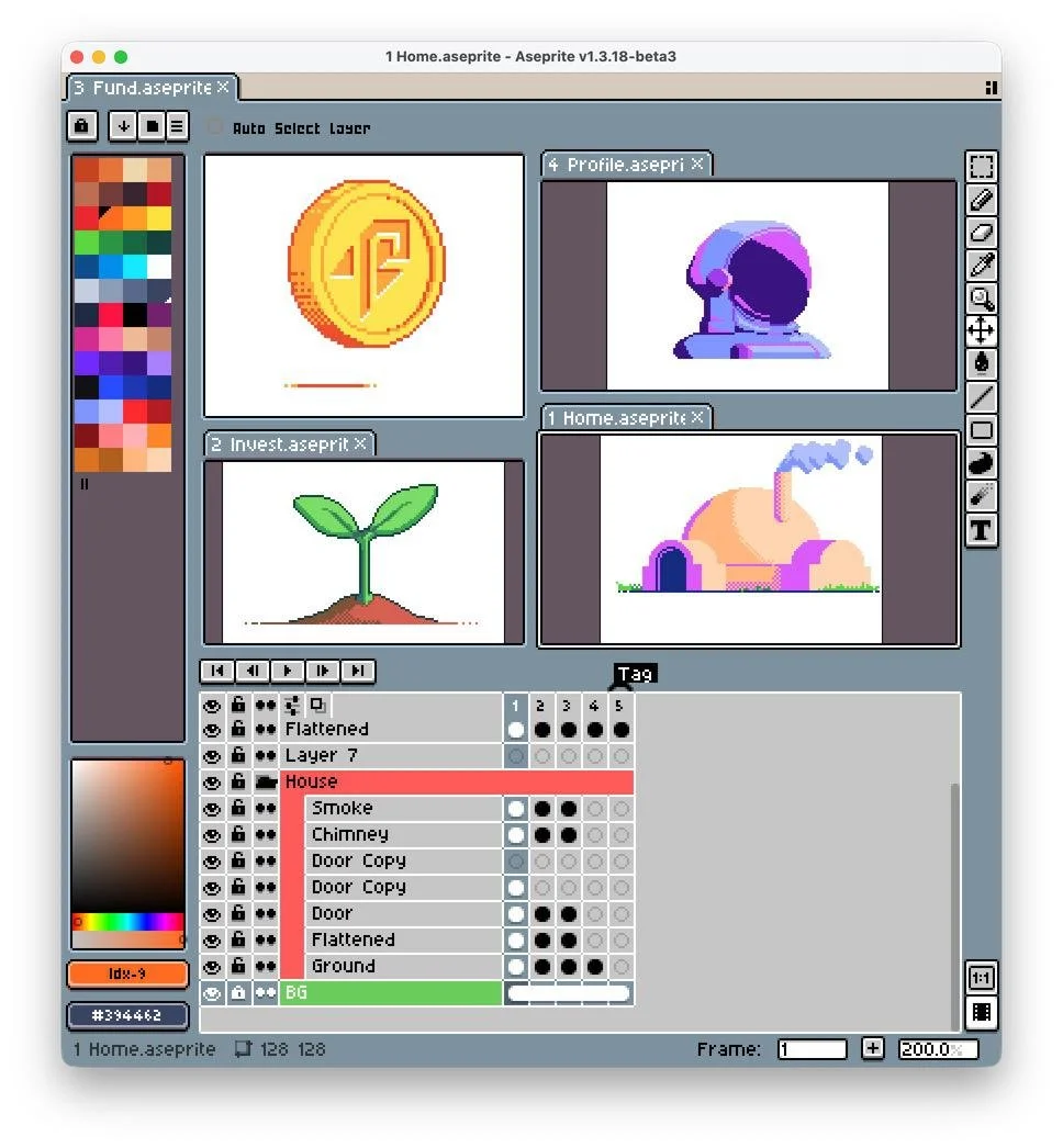
Some of my first and second drafts. The “home” illustration was particularly interesting to create, as they wanted it based on buildings in Star Wars.
The first draft went around the whole team before we had our first review meeting:
"Great work again — I sent the illustrations around the horn yesterday and heard many good things."
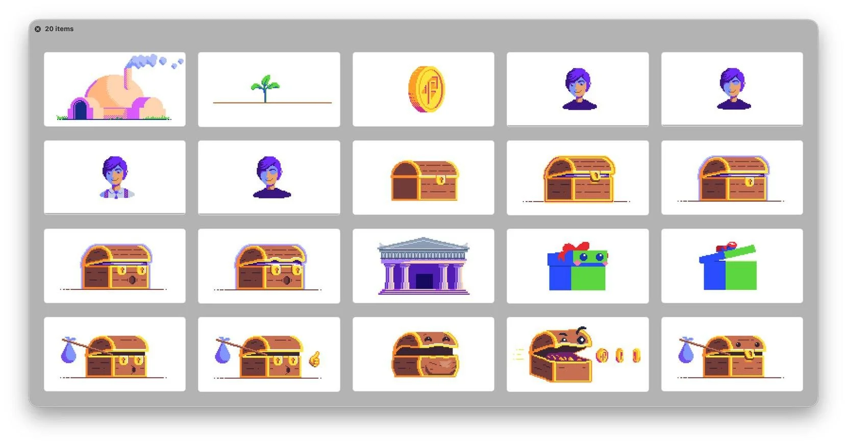
Mostly concepts and initial drafts here, many of which didn’t make it into the final product.
The key creative pivot that came out of that meeting: simplify everything toward iconography, commit to a square canvas, and anchor each piece to a single dominant color with minimal supporting palette. From there, I moved fast — Draft 2 introduced outlined versions and a first astronaut candidate; Rocket Dollar confirmed they wanted the outlined style and that direction was locked.
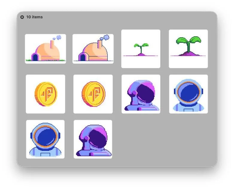
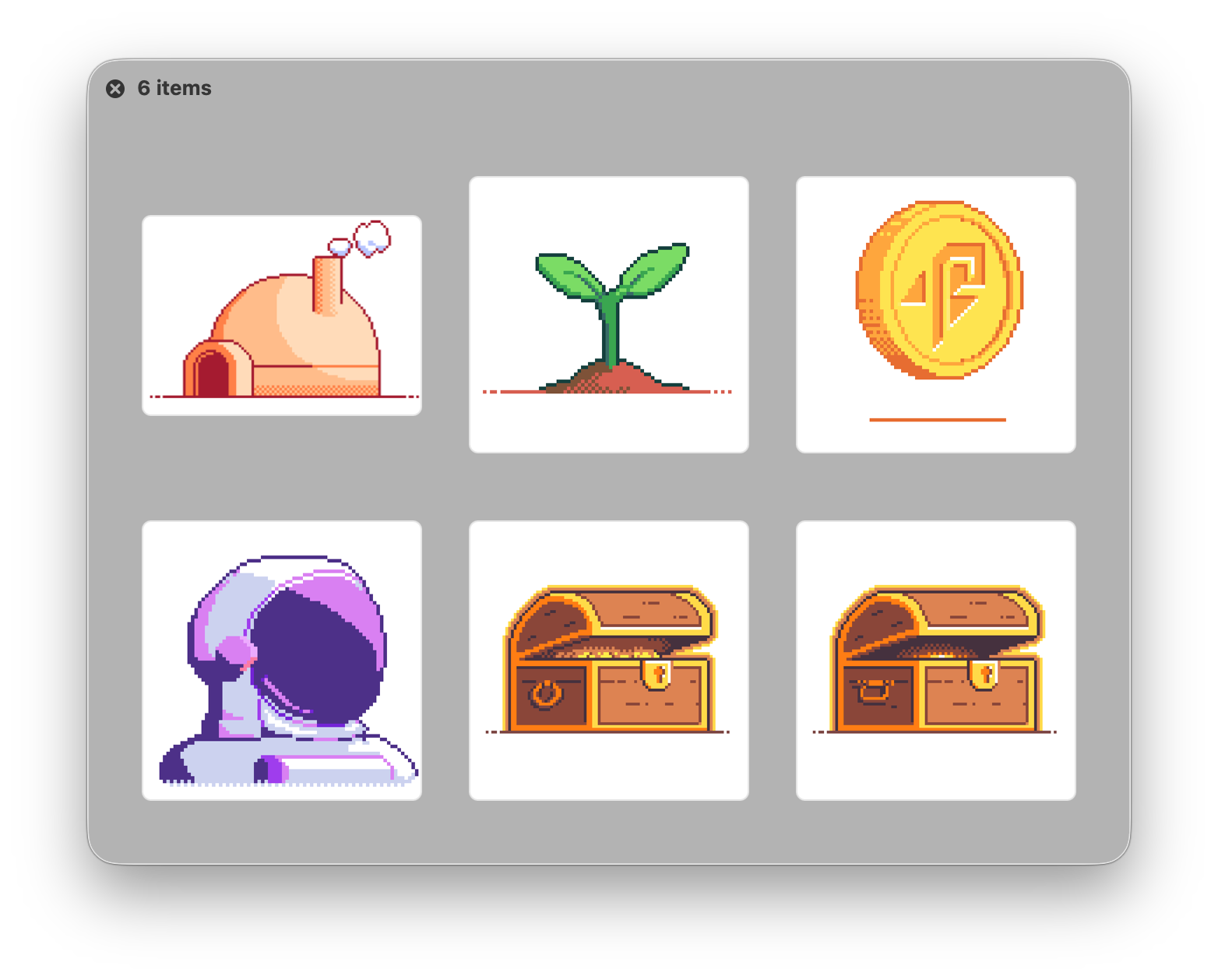
Draft 3 established the 128×128 production canvas, with scaled 512×512 exports for HiDPI delivery. Throughout the process, I maintained a shared Google Sheet with a dedicated tab per draft, space for inline comments, and a mirrored Google Drive folder with annotation permissions. That setup meant feedback didn't require a meeting — it could happen asynchronously whenever their team had bandwidth.
Final and near final drafts. The treasure chest design took a lot of iterations and experimenting to find just the right art for them.
The final invoice came with a note from their CTO who paid a bonus on top of the agreed amount, specifically for the quick turnaround. He closed it out with:
“You're our go-to for the next round of art regardless of style on pixel or vector art."
Project 3 — Section Art / Vector Illustration Refresh
March–June 2022
Five months passed. Rocket Dollar had been dealing with development delays, but in late March 2022, Rodney reached back out: they'd just shipped the new version of the web app — with my illustrations in it — and wanted more.
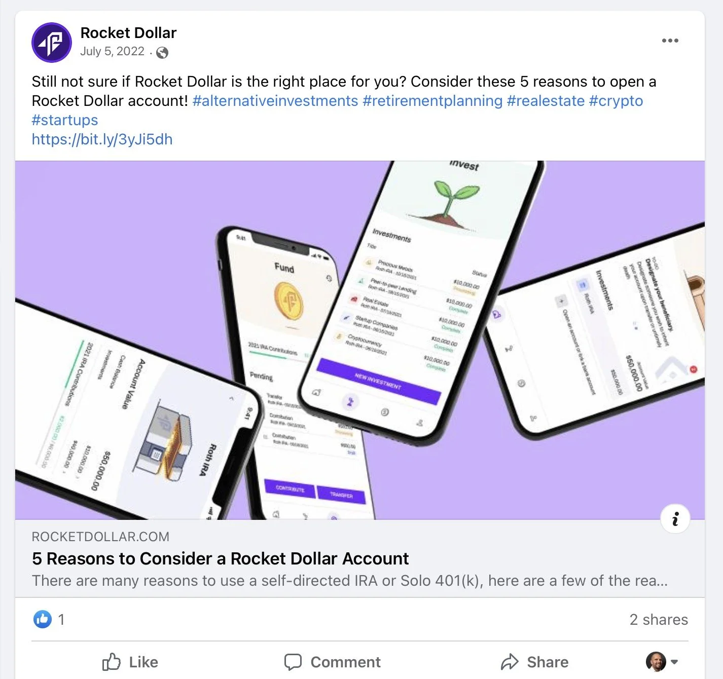
One of several blog post shares in 2022 that also contain screens with my illustrations. While the shared article doesn’t feature and isn’t about the artwork, it’s a compelling read that you can check it out here.
The initial ask for this engagement was open-ended: concept illustrations for broader product themes (cryptocurrency, real estate, surveys). I started exploring those directions in earnest — rough vector sketches with background experiments, ideas about using the space imagery from their marketing site, even a quick note that I had After Effects capacity if animation became a direction they wanted to take these. That last one didn't land immediately, but it planted a seed.
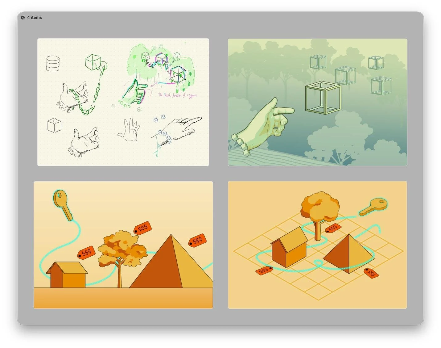
Early concept sketches for a cryptocurrency illustration — exploring blockchain structure, natural growth motifs, and a sense of effortless participation. The direction pivoted before these went further, but the ideas informed what came next.
Quickly, though, the brief shifted. After they discussed the illustrations further with the CEO, the project pivoted: rather than adding new conceptual illustrations, they wanted to reconcile the existing pixel art icons with the illustration style their in-house designer Katelyn was building out across the marketing site. The goal became creating polished vector versions of the existing app illustrations that would feel at home in both contexts.
On my side, I reorganized the work into two projects:
RD-03 (Section Art) — vector artwork intended as cover/section images for specific areas of the app
RD-04 (Illustrations) — the broader conceptual pieces, placed on hold
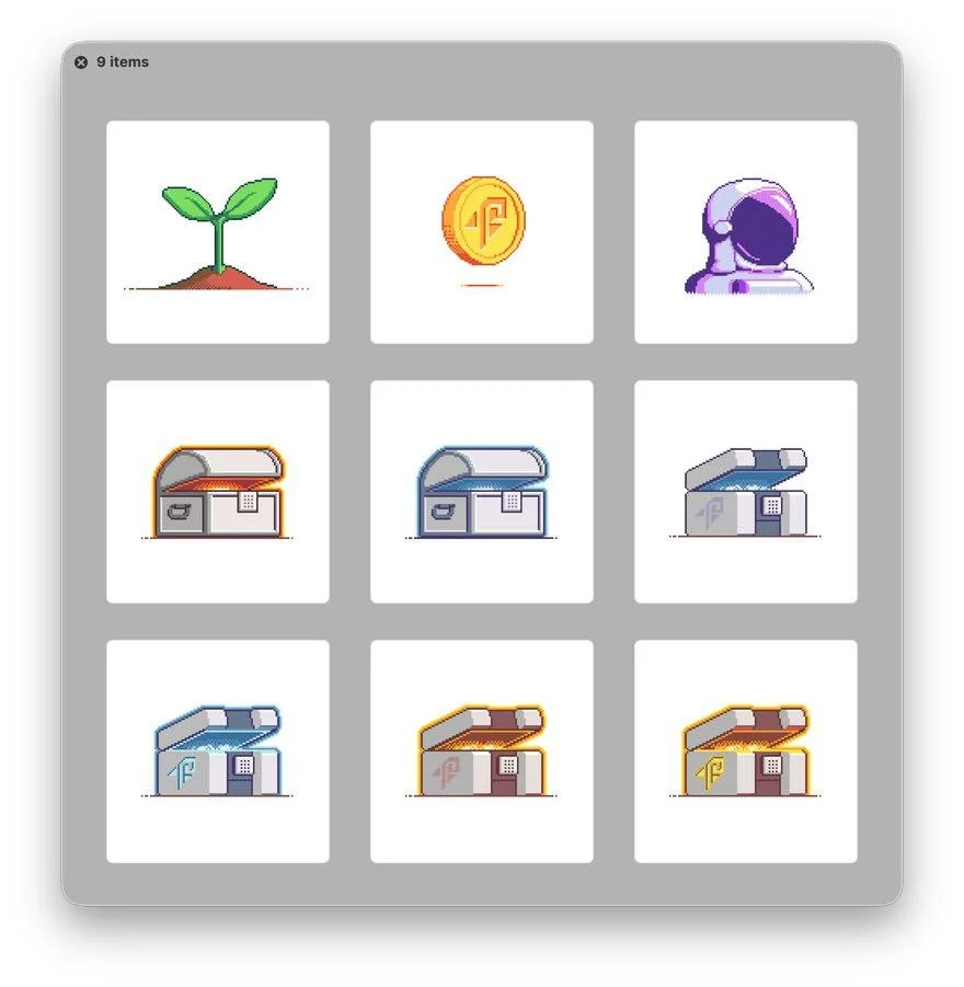
For the Section Art, I went back to the core subjects — Home, Coin, Treasure Chest, Astronaut — and rebuilt them in Illustrator, now aimed at a more refined, detailed style.
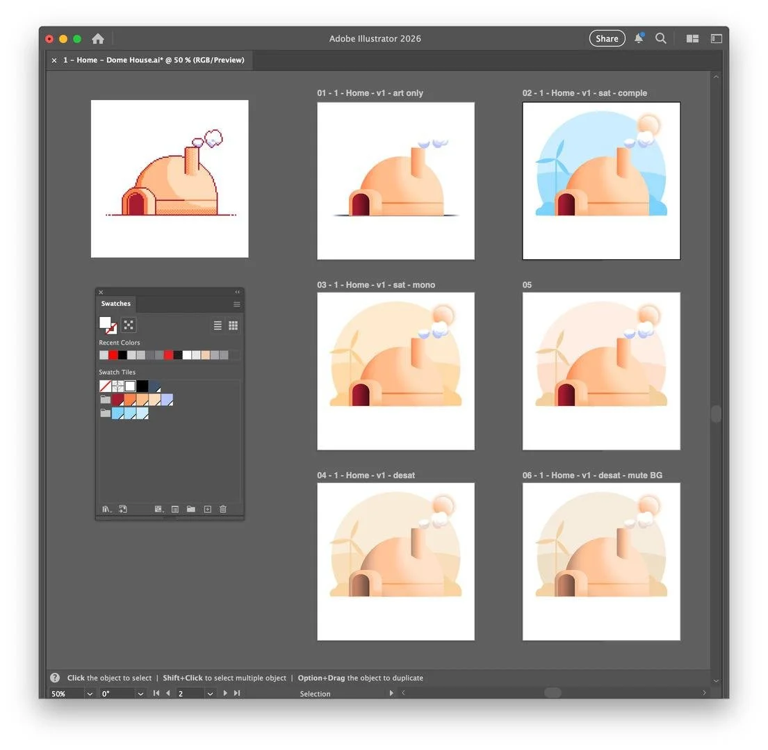
As we progressed, Rodney determined that monotone, desaturated art worked better for their use cases.
The chest later got replaced entirely with a safe (Rodney's call, since he wanted something that felt more modern and secure), which gave us a new design problem to solve from scratch: keypad vs. dial, conventional vs. futuristic. We went with a modern keypad version after a round of sketches.

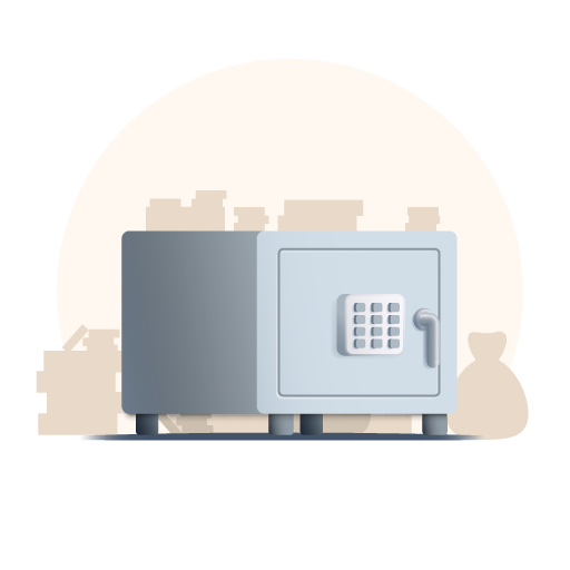
Each deliverable came with PNG, JPG, and full Illustrator source files. By June 2022, I delivered the complete approved set with a clean folder structure that included Drafts, Illustrator Files, and PNG exports , and wrapped the project.
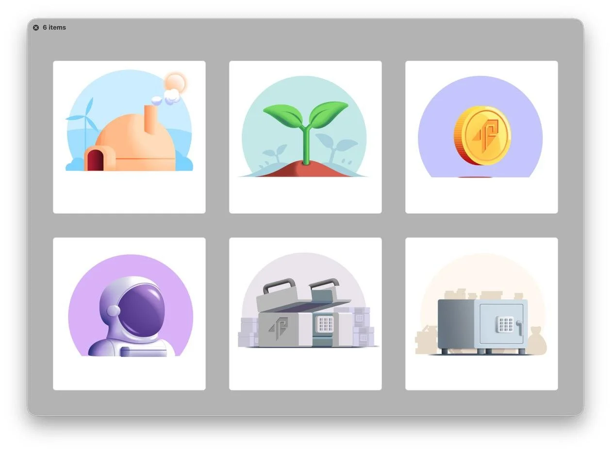
Some of the near-final and final drafts.
What the Relationship Looked Like
We completed three projects together across nine months. Every engagement started because they came back. The DeLorean animation led to the app illustrations; the pixel app illustrations shipped to production and soon led to the Section Art vector refresh. Each time, the scope expanded and the deliverables got more technically complete (GIFs → flat PNGs → production Illustrator files with source).
Rodney's team was collaborative in the best way, in that they had well-defined opinions, gave specific notes, and showed up to calls when they said they would. When feedback stalled (Rodney was out with COVID for a stretch in May 2022), the timeline slipped but the work didn't; I just worked ahead on what I could, and the pieces were ready when he got back.
The whole engagement ran on a shared Google Sheet, Drive folders with commenting permissions, and Bill.com for invoicing with minimal project management overhead. Our collaboration went smoothly with organized deliveries, clear communication, and work that got used.
Skills: Animation (GIF/frame), Icon Design, Vector Illustration, Adobe Illustrator, Client Communication, Project Management